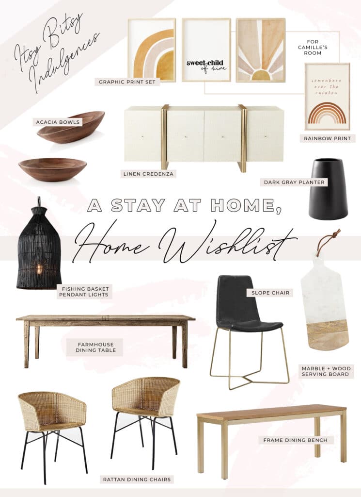
Having spent an unprecedented amount of time in our home over the past several months, I’ve had some time to really think about some of the areas that we have neglected to really put together. And when I think about one area, it always spirals to another area, and then I have the entire house remodeled all over again. Kidding, obviously, but being in our home so much has really allowed me to gain some perspective on the way I want to feel when I’m in the home and the look that will help us to attain it….
I think it’s taken me so long to finish the interior of our home because I am so indecisive when it comes to interiors. It’s such a big commitment that I’m worried I’ll get “sick” of something… or that it won’t all flow together. Exteriors, like the backyard and landscaping, is so much easier for me for some reason….
Anyway, all that aside, I’m sharing some simple inspiration photos below (original sources linked below…) and the ways in which I hope to have them come alive in our own home. Also chatted a little more about the items you see in the collage above!
Have a great day everyone!
DINING SPACE
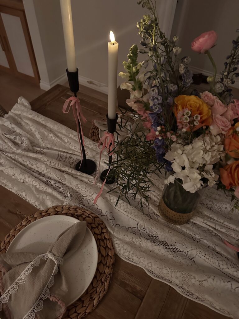
I titled this “Dining Space” because we don’t have a “formal dining” area…. it’s adjacent to our kitchen, and since we eat most of our meals at our island counter, when we use the table it’s usually for larger gatherings. This space has been sort of “undone” since we moved in. The table + chairs are from our condo, and I didn’t tackle the space because I wasn’t sure what I wanted from the area. After re-doing our floors, I decided I wanted to add in some darker colors. I wanted the dining feeling to feel moody, modern, + beach-y… sort of a blend of the following two images:
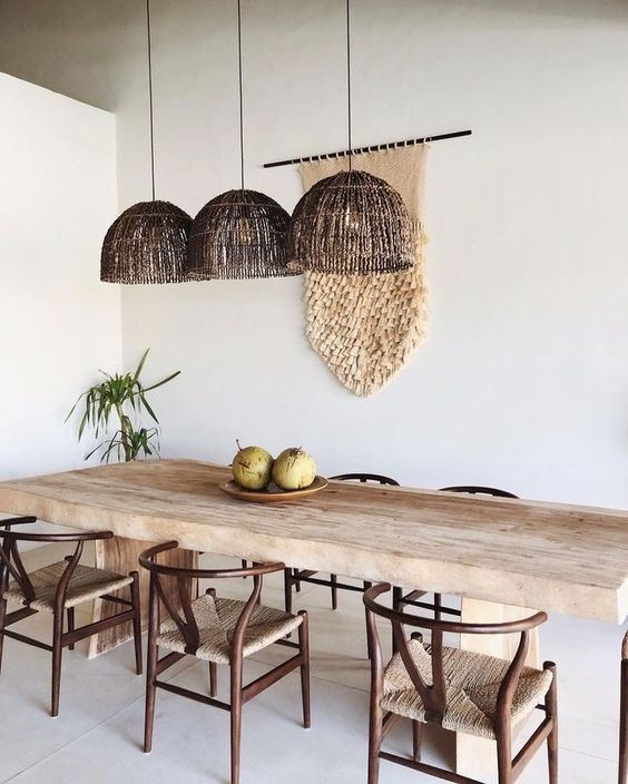
(Source)
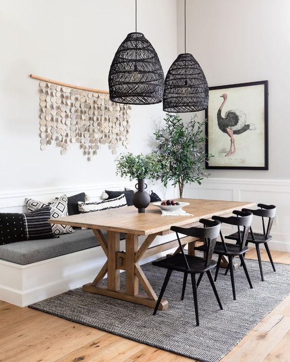
(Source)
From those two images, I thought that the dining section of the above collage would make sense for our home. That includes the following pieces:
RECLAIMED WOOD FARM TABLE: I looked around a long time before finding this table… I think it took so long because I wanted a truly “reclaimed” look, and also needed the table to be extendable. Since we don’t have a lot of space in the dining area, having a table that is extendable allows me to have more space when we have a larger party coming together (enables 8-10 people versus 6). A few other tables that I liked as well include this one + this one.
RATTAN DINING CHAIRS: In my attempt to create a balance between modern and beach-y, I like these rattan chairs as accent chairs… being placed at both heads of the table.
SLOPE CHAIRS: To further create a balance between beach-y and modern, I chose these slope chairs in black leather + antique brass. We have these in the counter-stool version and they’re super comfortable.
FISHING BASKET PENDANT LIGHTS (small size): And the black rattan pendant lights are such a unique shape that I decided to create a cluster of them above the dining table. The black gives it the moody look I’m going for and the rattan makes it perfectly beach-y.
ENTRYWAY
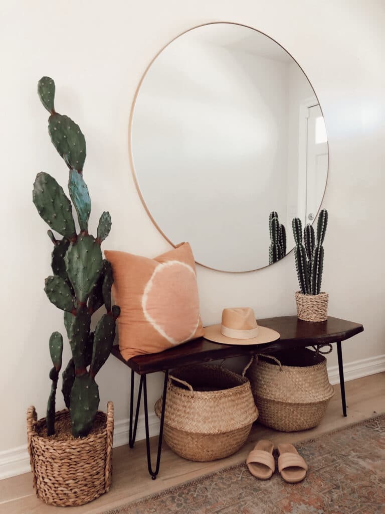
I am not 100% certain how I want to address this area, but I don’t think it needs any major changes. I still love the mirror + baskets in the area. I am considering changing out the bench to this gold + wood frame bench (seen in above collage) AND/OR change out the cactus. Changing out the cactus would lend itself to this black pot and possible a large snake plant (probably a good fake because the thing wouldn’t last with toddler hands digging in dirt…). I think that would take it away from a desert feel and lend itself to a more modern beach-y feel. Again, not 100% certain but that’s what I’m thinking about…
OPEN WALL
I don’t even know what to call this area, but I’m referring to the wall space on both sides of our fireplace (where we also have our TV). Right now, I have a credenza + round mirror to one side and it’s a completely open wall on the other side. The more I sit with it, I just keep feeling as if the symmetry is off and all wrong. So we’re considering book shelves on both sides, like the image below, with black cabinetry to add some dimension and color.
OR, another idea I had was to have two matching credenzas on both sides of the fireplace and have built in shelves above them…
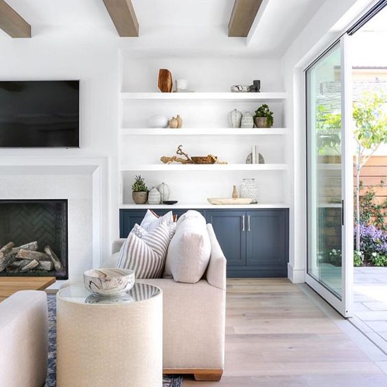
(Source)
KITCHEN
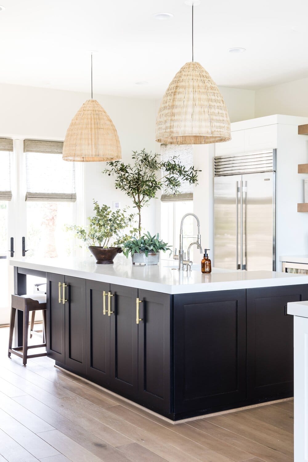
The biggest, and really only, change I want to make here is to paint the island black. When we added the new flooring it changed the entire complexion and feel of the house. We went from the original red oak floors (which we attempted to stain, but the red/orange tones kept pulling through) to white oak floors which made the house feel so much more open, light, and airy. Given that, I felt as if our space could use some bolder colors. Hence my new obsession with painting our island. Here is the inspo photo that I’m loving….

(Source)
A FEW OTHER ITEMS I’M LOVING
ACACIA BOWLS: I love these beautiful bowls for elevating any midweek dinner… I eat all of my meals out of bowls and think these are just beautiful….
DARK GREY VASE: I think this would be a beautiful addition to the middle of our kitchen island… especially drawn to the shape….
MARBLE + WOOD SERVING BOARD: I think this serving board is a beautiful option for a cheese platter or other “finger food” appetizers for a happy hour at home.
GRAPHIC PRINT SET + RAINBOW PRINT: Both Harper + Camille are in need of some wall “art” and I love these sweet prints I found on Etsy….
