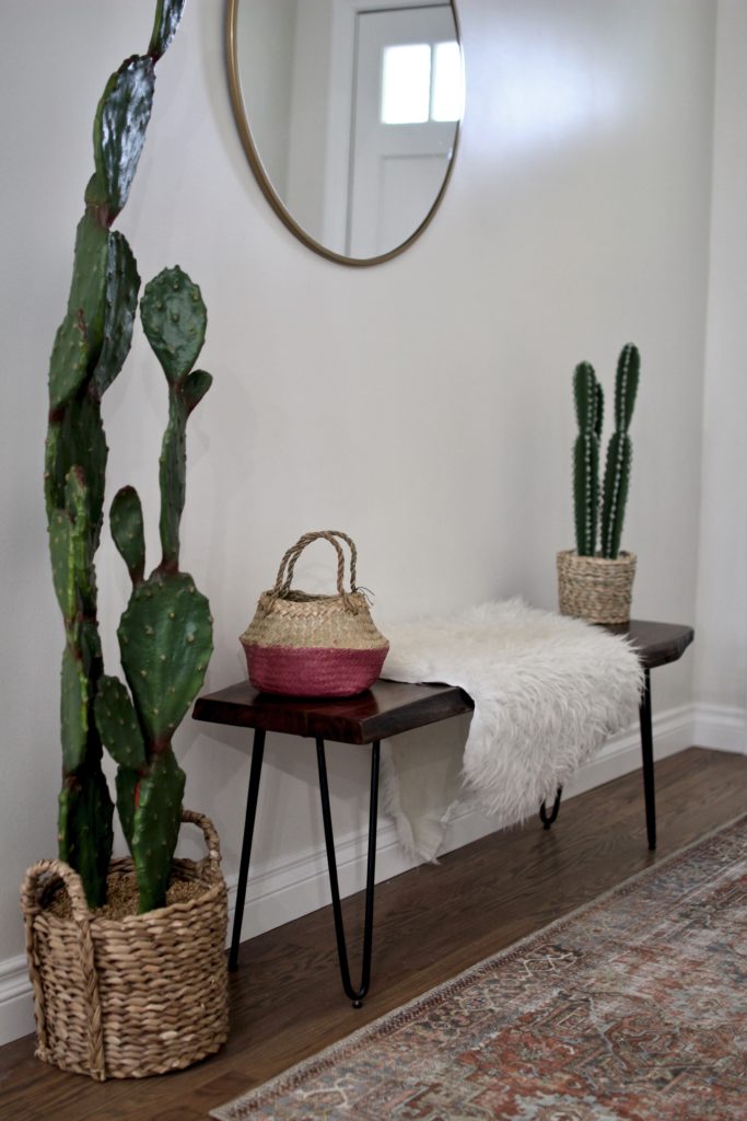
When we were first making plans for the home, my initial desire was to knock down every wall that was up in the living space to make it a complete open concept. The thought of having an entryway felt a little closed off to me…. and never even crossed my mind. After chatting about some of my thoughts with my friend Vanessa (who is an interior designer and put together the plans for our master bath/bedroom layout) she highly suggested an entryway and gave me her reasoning. TJ was sold, but I was still a little hesitant. After coming from our small condo, I truly wanted a space that felt open + airy…and I was afraid that an entryway would hinder that goal. Yet I wanted to honor TJ’s design vision as well, so we kept the half wall.
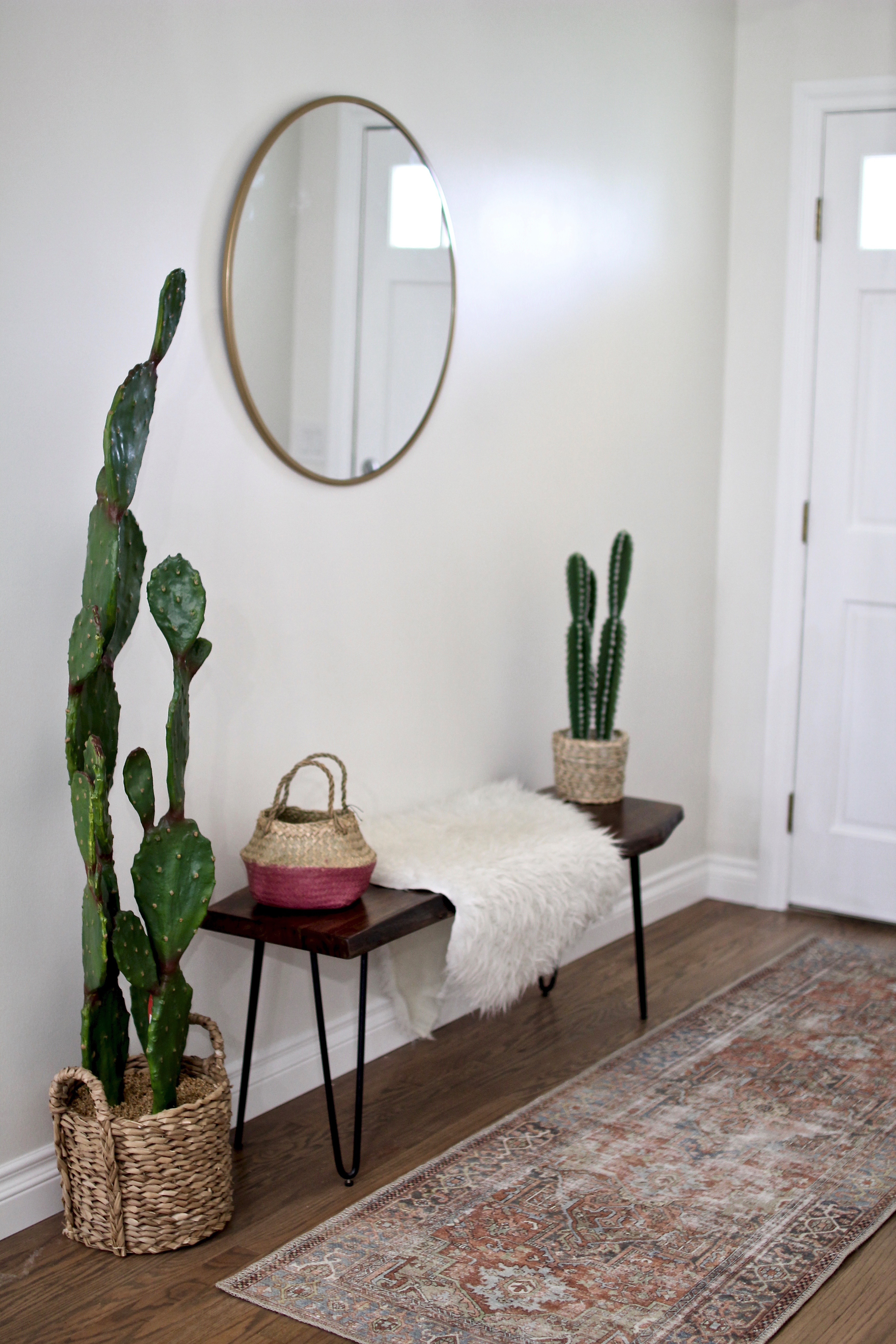
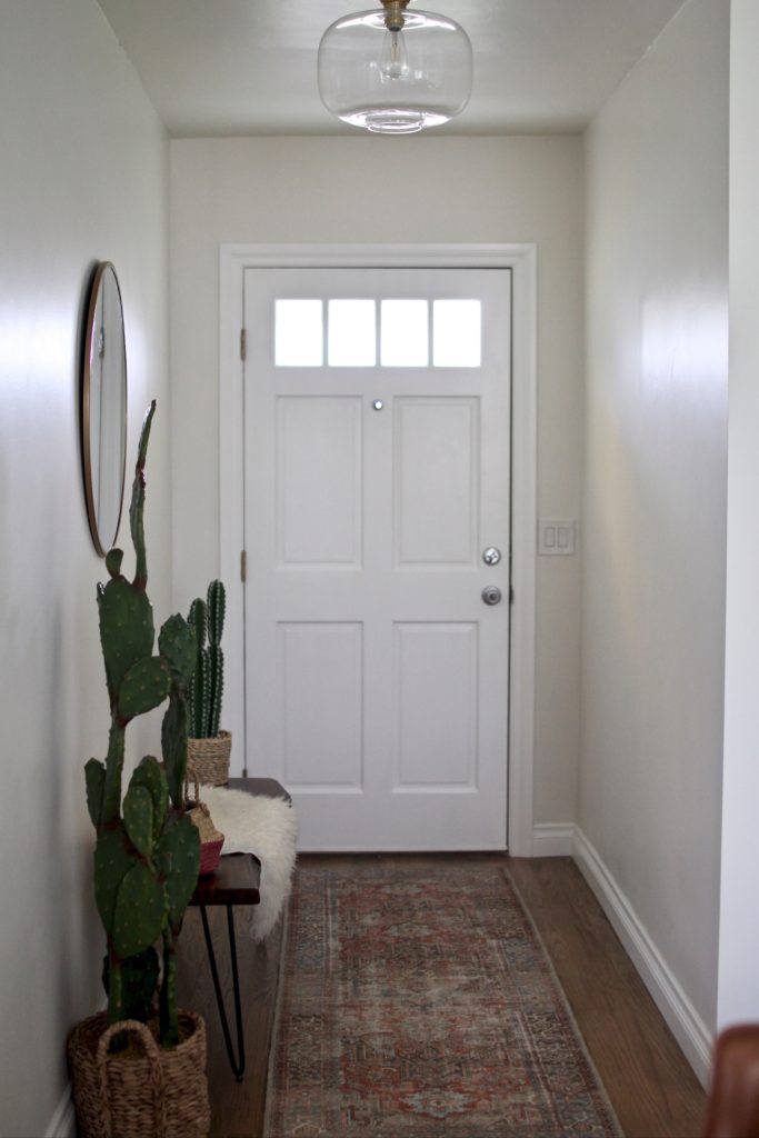
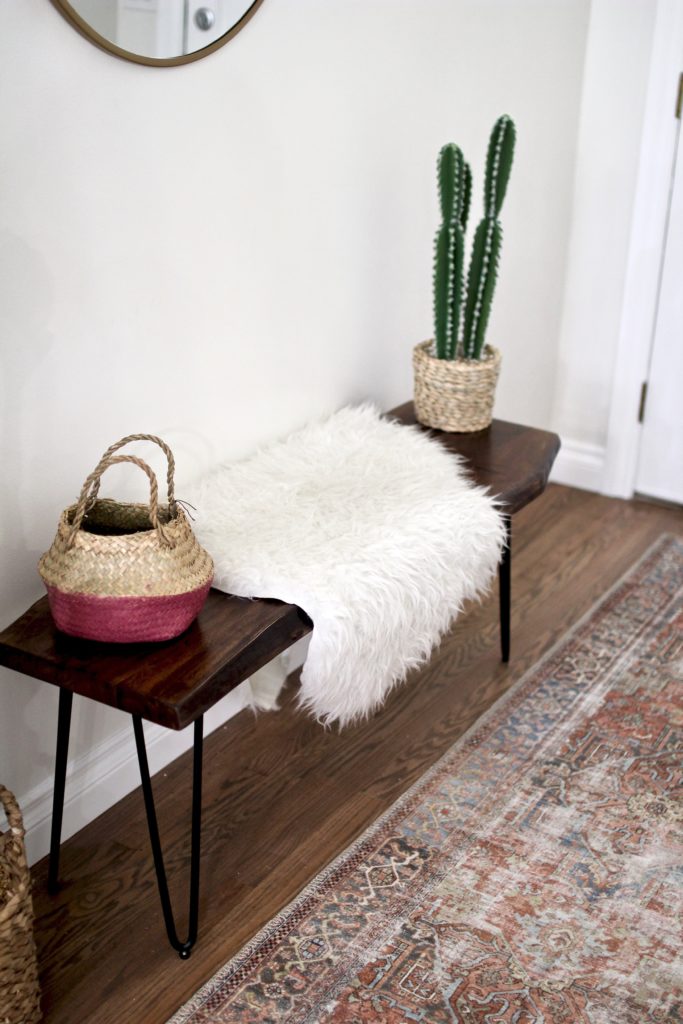
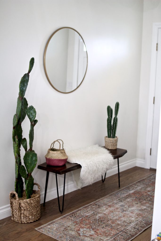
And I couldn’t be happier that we did. The entryway provides a nice welcome to those visiting, and also allows us a space to put our shoes, keys, + bag… out of site from the rest of the living area, but also easy to grab as we head out the door. When it came time to decorating it, I knew I wanted it to reflect the same feeling as the rest of the house… as if you’re stepping into a small piece of California… bright, airy, organic, and simple. I naturally took to Pinterest for design inspiration and stumbled across two images that caught my eye… I combined the two looks together for our finished entryway look. I’m so happy with how it turned out, and in all honesty, TJ and I can’t believe how much it makes the house feel just a little more homey…..
I also knew that I didn’t want to spend a ton of money on the entryway…. as there were other parts of the home I wanted to splurge more on (i.e. living room + the bedrooms). I love this round mirror from Target… it’s excellent quality (not as heavy as the Anthropologie mirror I purchased for our living room) and such a great price point for a brass round mirror. I love it so much I’ve considered purchasing it for our guest room/office as well. Target also (currently) has a pretty great selection of faux plants… and I initially thought I’d decide between these two cacti… but in the end decided I liked them both… they look real (without the poke) and the baskets are such an added bonus. The bench took a little more searching. I initially thought about a distressed farm style one… but then decided it wasn’t the exact look I was going for… and when I stumbled across this bench, I knew it would perfectly complete the space. I also can’t recommend this rug enough… the colors are beautiful, not too bright, and I love the subtle addition of color it provides against our white walls. Obviously the basket houses our keys and earphones….
That’s it… such a small space, but one that has made a huge impact on our home.
____________
(Details || Mirror | Rug | Bench | Large Cactus | Small Cactus | Basket | Faux Sheepskin | Flush Light)
